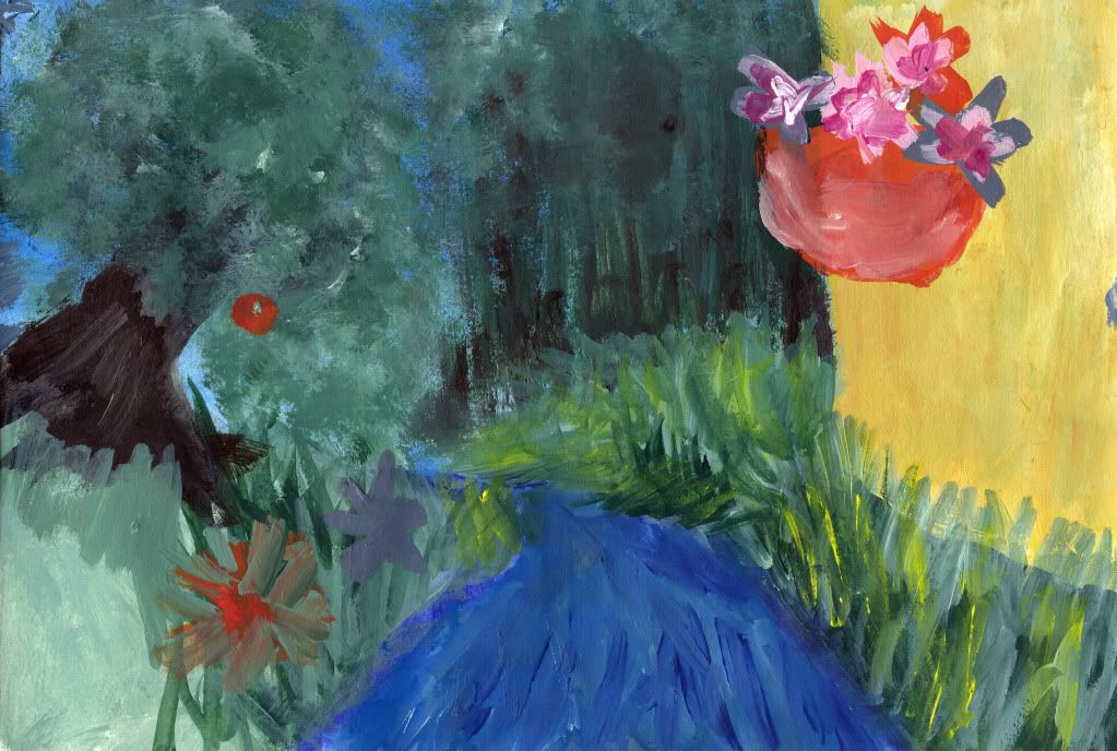
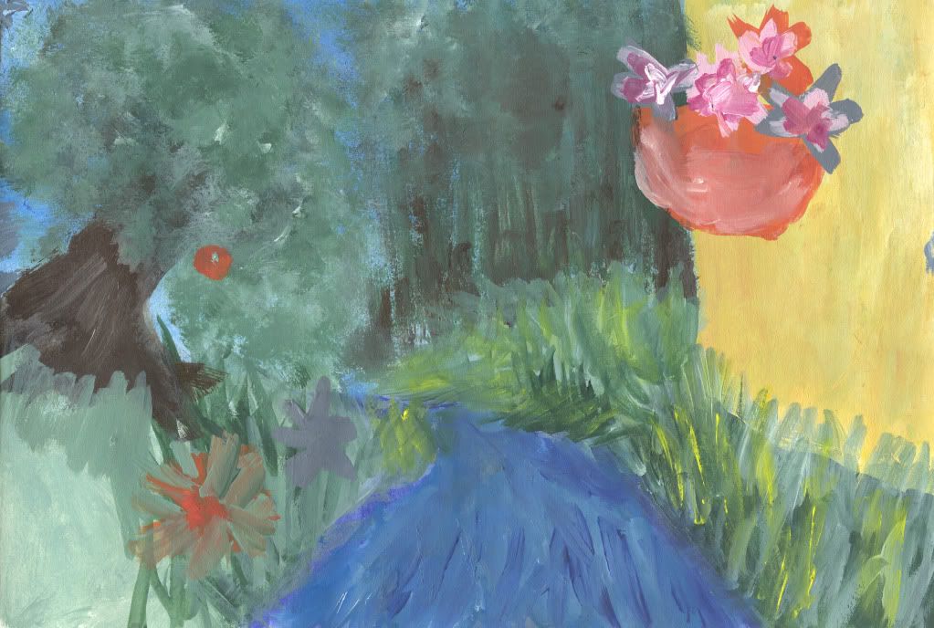
After talking to Alan on Thursday about how to go about making this a 3D world I set about painting this. He said I needed to figure out my final concept as well as starting to build some of my set. He showed me a way to create the 'painted feel' as seen in the film 'What Dreams May Come'
(2:29 onwards)
I'm semi proud of how this turned out. I wasn't planning on painting the piece on the far left, however it was pointed out the the original needed extending. So I stuck another piece of paper next to it and continued. I'll be taking this into Photoshop to give it a polishing, The left side bugs me to no end. Everything is so sloppy and messy. I've tried painting over parts to try and re do it, but I fear it's past that stage. Although I feel the left side is a disaster, I'm glad I've put this together. I'm glad I've done this, I've realized a lot about how my world will look and where everything is. Next step, drawing the buildings which I want to be my main focus and making them in Maya.
Saturday, 26 February 2011
Thursday, 24 February 2011
Dynamics: Particles, Emitters & Forces
Fuse_Dynamics from Levalin on Vimeo.
Explosion from Levalin on Vimeo.
Drain_Dynamics from Levalin on Vimeo.
Wednesday, 23 February 2011
For Alan: Compleated Narative Maya Tutorials
Cartoon Character:
Cartoon Character Turnaround from Levalin on Vimeo.
Mustang Model:
Lip Sync:
Lip Sync: Finle from Levalin on Vimeo
Tuesday, 22 February 2011
Monday, 21 February 2011
11 Second Lip Sync: Complete
The finale part of my own lip sync. Now all that is left is to wait for news on where my cartoon character has gone wrong before I can finish it.
Lip Sync: Finle from Levalin on Vimeo.
Experimental Scene: Textures and Lighting
Added textures to the scene that I've modeled to get a feel of how my environment will play out. Really like how it's turning out so far, what with how all the colours give the world a painterly feel. However the only small problem is that the scene is the wrong size. Phil pointed out that it wasn't in the film ratio 16:9. However seeing as this is merely an experiment it shouldn't matter too much (I have to remember the film ration for later though).
Friday, 18 February 2011
Mansion and Museum Thumbnails
Thursday, 17 February 2011
Wednesday, 16 February 2011
Tuesday, 15 February 2011
Laying Out UVs
Logo Attempt
First attempt to create a logo which represents me. I tried to include the wolf as it is an animal which I feel represents me. The background is simply there so that the image can be seen a lot clearer. Otherwise it would have a transparent background. The image was created using inks and a special pen I have for them.
Experimental Maya Scene 4
More Thumbnails
Seeing as I have Brownies on Monday night, I figured I might as well take advantage of the train journey back to Faversham to do some thumbnails. These were done with the watercolour pencils. This is because I found it easier to visualize my scenes if everything was done in colour rather than black and white. As Phil surges ted, I've broken away from the book a little because it would be too much to have everything described seen in different sets. I've also changed it from them being on the road and walking through the city centre to them traveling on the boat to the harbour. More so because I always imagined the city to be very close to the water and not miles away into the jungle.
As well as thumb nailing I also thought about how I could set up this scene and have the camera move around so that the audience gets to see everything which is described.
Start of with the camera moving to mimic the boat as it goes down the river
Camera moves and the audience sees the church, the playground and one of the mansions
The harbour is seen as well as the museum and another mansion or two
The camera then moves around the museum following now a pathway into the city centre and the audience sees the Theatre.
Camera them pitches out to see the city from above
Monday, 14 February 2011
Experimental Maya Scene 3
Experimental Maya Scene 2
Experimental Maya Scene
Been trying ti figure out how to build an impressionist painting in Maya, by using the marks to help define where I put my geometry. Hence the odd shape in the corner by the tree. The base, which is supposed to be the water I need to work on but at the moment I'm struggling to visualize that. I'll build the rest of it and then work out how to make the water look 3D.
Sunday, 13 February 2011
Impression Painting
Did some more painting the other day. As much as I like how the patterns on this turned out, I'm not too sure on the overall image. I need to use perspective properly and not simply paint what I see. I do plan on putting this into Maya. I did manage to get another texture ready for when it is needed. The image below is how I imagined leaves and other greenery to look like.
Thursday, 10 February 2011
Texture Tests
As well as painting textures for water I also tried to create a texture for the flowers in the window boxes. I had to photograph these as the yellow texture in the bottom left hand corner was created using pastels. I didn't want to scan it and make the scanner all dirty with dust from the pastels. I then took the images into Maya and applied it to a rough flower shape I created.
I'm rather pleased wit the result, though it is pretty basic. I also need to add a bump and spec map before it is complete.
Wednesday, 9 February 2011
Textures and Concept
I was going to upload these yesterday but for some reason blogger just didn't want to work. After getting all my art equipment out I started experimenting with different mediums for textures.
These two were created using acrylics (and goulash). To create the tree texture on the left I simply dabbed my brush over the page. I used a similar technique for the foliage on the right hand side. However instead of dabbing the paint on I simple 'drew' it on, using the paint brush like pencil. I'm rather pleased with how this turned out, however I'm not too keen on the markings on the right. Although I knew how I wanted to paint them, I wasn't 100% clear how the trees etc on that side were going to look. Hence why they look like blotches of paint simply shoved on top of a background.
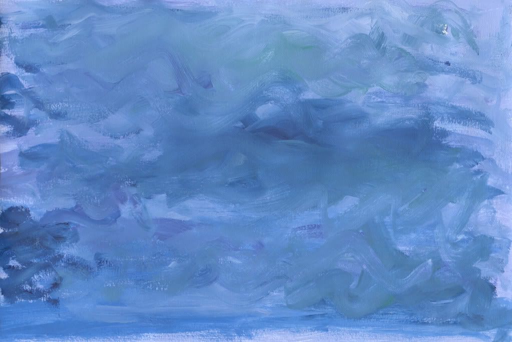
This one was my warm up piece. At first I didn't have an idea about what image I wanted to paint so I started out painting of textures. This one was for water or perhaps a sky.
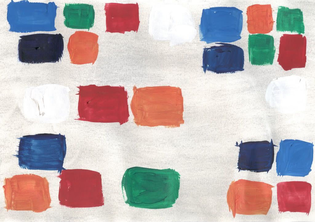
This image is the same. I don't really like this one and have no idea where it was going. The only thing I know about it was that I was thinking of the mosaics that is described to decorate the theatre.
Subscribe to:
Posts (Atom)