Wednesday, 31 March 2010
Tuesday, 30 March 2010
Monday, 29 March 2010
Disney- Up

I rather enjoyed the film. However I didn't see how it was supposed to be completely tear jerking at the beginning. Kinda guessed something bad would happen. Although I thought at first when in his childhood he was standing outside the bordered up house that it was because his parents had left him. After the beginning though the film was rather hilarious. I also find it rather interesting that Pixar give hints to what is about to happen. Certain objects are placed in the beginning of the film so they don't 'suddenly' appear towards the end.
Female Hatstand- Try 2
Ping Pong Ball Try 2
The bounce motion on this is a lot better, however it could be a little faster still.
Saturday, 27 March 2010
Different Animations
The first one is a mini animation I did to practise getting into the hang of using a program called 'Dragon'. Dragon for those who don't know is an animation program created by animators. It's very easy to use. The animation is created using cut outs of different materials (mainly cardboard and paper) and the backgrounds are ink and bleach. The music isn't that great because we had to create our own. We weren't allowed to find anything off of the internet.
The second one was for my Final Major Project at Maidstone. This time I chose to create the puppets and use stop motion to create my animation. Again I used Dragon to take the shots.
The music could have been better on this as well, however the animation had to make do with me playing the recorder.
Friday, 26 March 2010
Character Design- Female Hatstand


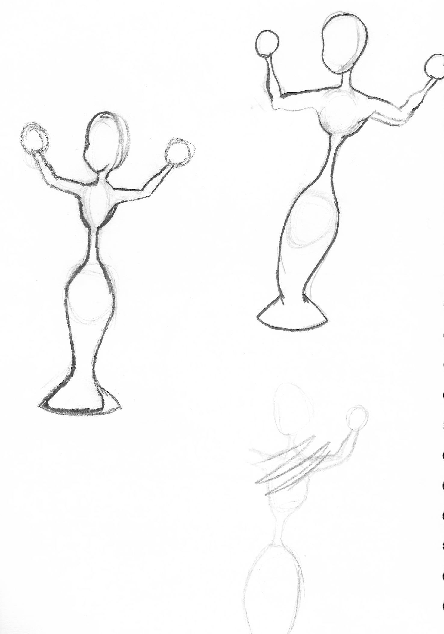
 have gone back to develop my character more and to try and convey what gender my object really is. Before my hatstand was neutral and didn't really 'show' a gender. Because my hatstand is supposed be really pretty and beautiful at the end of my story I looked at a few pictures of Jessica Rabbit. This was so that I could apply the 'hourglass' female body figure to my hatstand.

 The drawings of my female hatstand. I still feel the chin isn't right though.
The Savage Planet
I remember watching this at Maidstone. However I never really got into it, but watching the animation this time round, I found I rather enjoyed the film. I rather liked the style of the animation. The fact that everything was detailed and yet still had a cartoon like feel to it.

Phil- Time Machine Essay
http://thelastearthangel.blogspot.com/2010/03/time-machine-essay.html#comments
The Tune

Thursday, 25 March 2010
Bowling and Rubber Ball Animation
My rubber ball animation and the bowling ball one. I need to work on making my animations move slower. Plus I think my rubber ball needs a few more frames added in to remove the jerkiness of it.
Life Drawings 23rd March


 For the first three poses we had to draw quickly and focus on light and dark tones. I decided at first to focus on drawing the legs and feet of the model. For the second two I was told a style was starting to form. To keep drawing a round outline of the model, but then rather than go around it in a simple dark outline, use lighting and shading to add more depth to the figure.
 Monday, 22 March 2010
Jan Svankmajer, Brother Quay and Jiri Barta

Where as Svankmajer and Barta tend to have a narrative within their animations as well as a readable environment.


As mentioned in before in previous posts I have also seen Jan's version of 'Alice'. When I first watched the film, I did wonder what on earth he was thinking. However although it doesn't follow the story 100% accurately it is easy to grasp the context of the film. Although I do also wonder how long it took him to animate some of his ideas. Especially during the one where the different figures eat each other into smaller pieces at a time.

Time Machine Essay- Spirit

Enviroment Design Final

My environments for where my animation will take place. I'm not too sure with how it turned out though. I need to work on my watercolour skills. I used to use them all the time in secondary school but haven't used them in ages. However Matt started using them and from there on I had the urge to use them to.
For my animation however I'll be keeping the background in black and white. Mainly for when it is needed. When the environment becomes unimportant, I'll take it out or make it very simple.
Essay Research
 For my essay research I've been looking at 'The Art of Animation' by Don Bluth. Its been relatively helpful. There's a quote in there that Bluth uses which mirror's Phil's words.
'The story ideas and gags will be better after they are animated. This is absolutely NOT TRUE. Animation will only dress up your material. Good story material can be poorly animated and it will still play for the audience. Bad story can be superbly animated and it will never play. Your animation, no matter how wonderful, can never overcome a poorly written script.'
Don Bluth
http://www.cataroo.com/DBbio.html
http://uk.movies.ign.com/articles/035/035877p1.html
http://www.donbluth.com/hstry/dnsbio.html
Also looked at a few interviews with Don Bluth about his animation.
Sunday, 21 March 2010
Storyboards
Thursday, 18 March 2010
Morphing Name Animation
My name animation. I chose to use my nickname, Lev as Charlotte was too long. However Lev was too short as the minimum amount of letters was 4. So had to add an extra letter on the end. Chose A because a friend of mine sometimes calls me Levalin (no idea why, I guess its just what she came up with from Lev). I chose the lightning bolt for L because I do like thunderstorms but when a storm is close, I can feel the pressure in the atmosphere changing. My head tends to hurt until the storm arrives.
The Earth was chosen as Jackie gave me the idea to represent traveling. I don't really travel around the Earth, but I do go on a lot of hikes and outings with my rangers group. The violin was to represent the fact that I'm musical. I used to be in a choir and although I don't learn the violin, I do learn the piano. Lastly the UFO and stars for the letter A because I love Sci-fi and anything to do with Aliens.
Character Design- Colour and Sketches

This was another attempt to get my character in it's environment. Plus thanks to Phil I now have an idea which I want to work with. The idea is if the hat stand was a female one then it could be covered in coats, hats and other items. It sees herself in the mirror and is unhappy because she thinks she's fat. Then as time goes by the items of clothing are taken of and she sees herself in the mirror. she is astonished to see that she's not fat at all but has a lovely body for a coat stand.

With that idea in mind I then drew my hatstand as to how I imagined her to look. The one on the left is what she'd look like without all the hats and coats etc and on the right, how she'd appear laboured down with all the garments.
 This is just another drawing of my character. I remember Godwin suggested I make it as simple as possible so I removed one or two details. However I'll move the ring in the middle where the umbrellas go down a little so it rests more where the hat stands 'hips' could be.
Wednesday, 17 March 2010
The Hallway
Life Drawings 16th March
 I rather enjoyed life drawing this week. This first pose was rather hard to do. The position the model was in and the angle I saw her from was hard.
 This second pose was a lot more difficult than i thought it would be. I thought it wold be really easy as the model was simply curled up.
For this pose, we had to concentrate on the shading. We were instructed to forget using lines and simply use tone to depict the shape of the model. Although I can see a fair few mistakes proportion wise, I'm rather pleased with how this turned out. The same goes for the next pose.

 This final pose was drawing using the same technique as before, using only the shading to depict the model. However, I really dislike this one. The proportion is completely wrong. Her legs are in the wrong place and she looks as if she's loosing her balance. However I do like the shading on this one.
Tuesday, 16 March 2010
Jason and the Argonauts 1963
 Jason and the Argonauts was released in 1963 and was directed by Don Chaffey. It is a stop animation and is very well known for its scene with the moving skeletons.
I've never seen this film from beginning to end, however I've seen parts of it. I rather enjoyed it although it did get a little tiresome watching the actors slash at the air for about 10 minutes on end. And was it just me or did anyone else find Medea a little creepy? I had to check when she first woke up on the ship that she wasn't a puppet. The way she moved had an uncanny feel to it.

Monday, 15 March 2010
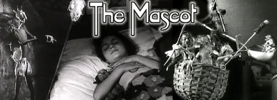
The Mascot- 1933
 "The Mascot" is a stop motion animation created by Ladislaw Starewicz. the animation was created in 1933. It is the best known of Stareqicz's animations.
I rather enjoyed this animation. I find it absolutely adorable that the dog went through hell itself to get the orange for the little girl. However I find Stareqicz's animation style very similar to another animator- Jan Svankmajer. Both give objects a strange yet memorable movements. The style has a creepy feel to it, yet not creepy enough for the audience to want to distance themselves from the characters.


