Saturday, 29 May 2010
Eurovision
Anyone watch it? If so thoughts? Some very good songs in there this year. Rather liked Greece and Germany's song and Spain to. However UK came last, we were so close to staying second to last. Oh well.
Friday, 28 May 2010
Thursday, 27 May 2010
CD Template and Cover
Wednesday, 26 May 2010
Final Animation- Take 1
I'm going to search for the sound of chairs scraping and add the talking of the students at the end over the bell as when I showed the animation to my family, they were a little con fussed as to what the bell at the end represented.
Animation With Effects
I know a few parts are extremely jump but I'll be putting it into Premiere now to smooth transitions etc. However effects have been added in and I'm hoping they look ok.
Life Drawing 25th May 2010
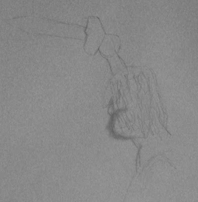
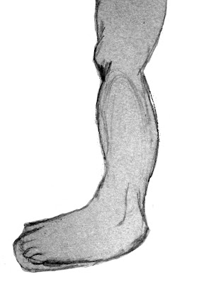
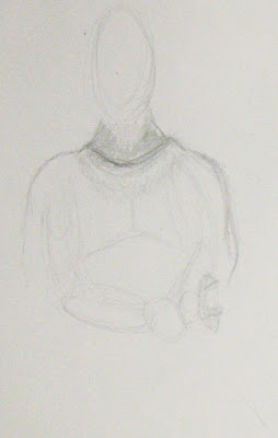
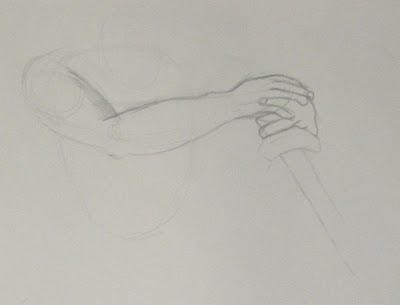
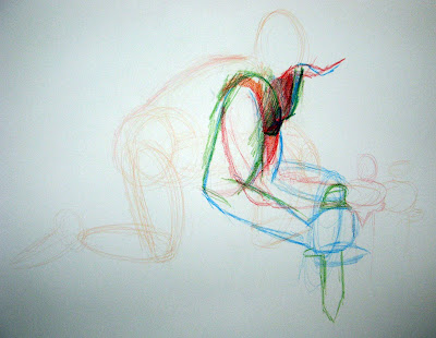
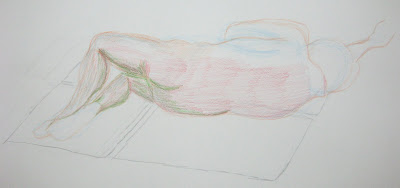
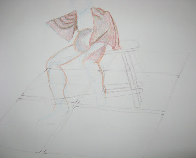
Decided to have fun with colour in Life Drawing this week. Was rather fun to be able to suggest what pose the model took and what medium to use to draw with.At first I went with using a red and orange pencil but Chris suggested adding in green and blue for contrast. Hence why the first drawing created with colours is a little bit abstract and hard to see what is happening. The reason for this is because the model had to move as the pose was rather difficult to hold and when he returned, he was in a slightly different position to what he started of with.
Tuesday, 25 May 2010
Making of Book Pages 2
Monday, 24 May 2010
Final Animation- Rough
I know it doesn't have sound, but I put all my renders together quickly, just to see what it all looks like as a whole. However a few things need editing such as a few frames the egg is too dark. Plus I need to put it into After Effects to add in the explosion. I plan on using the effect of 3D clouds we learnt last week to create the explosion using an image I created a while ago using bleach and ink. I'll be changing the hue/saturation as well as the blending options to make it appear as if I've used more than one image.

Making Of Book Pages
After Effects- 3D Effect
Don't ask about the title. Was the first thing which came to my head. Rather enjoyed making it though. I'll be using this sort of effect to make my explosion look relatively convincing.
Life Drawings 18th May 2010
Thursday, 20 May 2010
Edited Pre-Vis
Red did my pre-vis by smoothing out the how the camera will move etc. However I haven't done anything for where the explosion is meant to be because I want to ask Alan how to go about making it. I also changed the two shots at the end around. Instead of cutting backwards and forwards between the two divided cells, I chose to move to the second one and keep the camera still whilst it split before returning to the cell up front.
Textures and Lighting
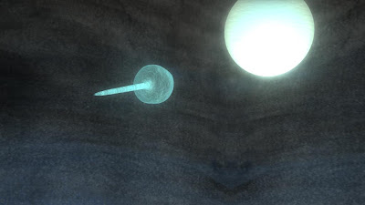 Textured the sperm today and like the egg added a texture to give it a little bit of depth as well as a gentle glow and some transparency.
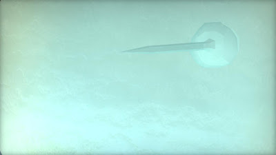 A quick render of the Zygote before the explosion.
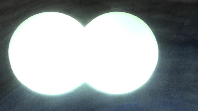 And the Mitosis stage. I will be changing the lighting on this so that its only bright when the cells are dividing. When the cells have split I shall change them so that the texture and colour can be clearly seen.
Monday, 17 May 2010
Making Of Page
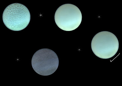
I thought seeing as I'm using the sky and earth etc to represent the Mitosis stage of a fern, I'd use the theme for my Making Of book. Phil also suggested putting the different stages of the egg on one page with a tick next to the one I used. I was going to have the tick over the top of the one I used like a ring round a planet but it was suggested that I move it to the side.
Into the Book pre-vis
I think I'm going to have to speed it up a little. Plus the textbook page isn't exactly what I'm after, but it gives me an idea of how the animation could appear. However I do like the fact that when the camera rotates it pans in on the word 'Mitosis'.
Edit of the Moon
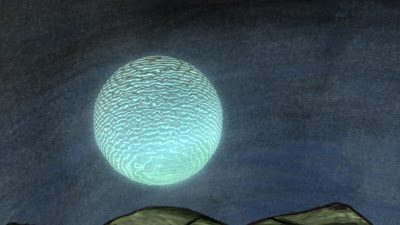
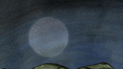

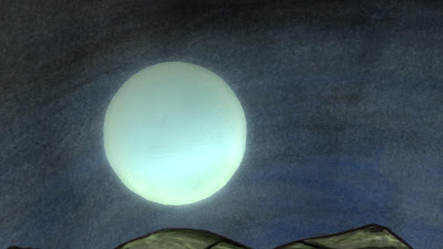
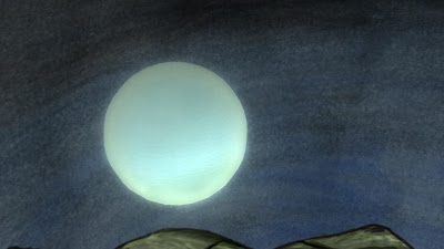
Went back and changed the glow. Also experimented with adding a texture to the transparency, however the effect looked too rough. Changed the colour of the transparency as well however it just made the egg too see through. Then went back and tweaked the glow and the bump depth. Rather like the way the last image turned out.
Moon Textured
Life Drawings- 11th May 2010
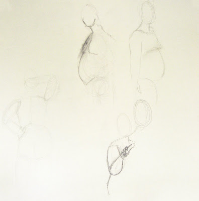
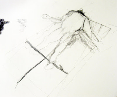
Rather disliked life drawing last week. Usually I enjoy the first few quick sketches but this time, no matter what I did my figure just didn't seem to work. I guess its where we've not done life drawing for a while that I'm out of practise. The second image we spent the rest of the lesson on and as it shows, I found it rather difficult getting the perspective and proportion right. Although I suppose there is something good about the second image. Ethan said it reminded him of the The Vitruvian Man by De Vinci where all my working out was.

Raytracing Or Not?
Final Background Texture and Moon
Friday, 14 May 2010
Thursday, 13 May 2010
Textured Sphere Tests 2
Textured Sphere Tests
Subscribe to:
Comments (Atom)


