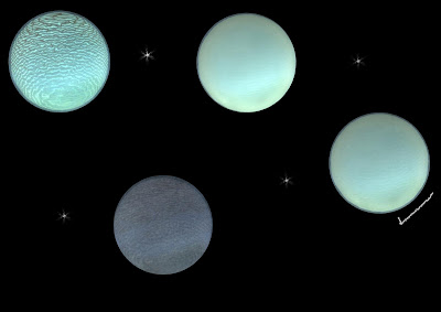
I thought seeing as I'm using the sky and earth etc to represent the Mitosis stage of a fern, I'd use the theme for my Making Of book. Phil also suggested putting the different stages of the egg on one page with a tick next to the one I used. I was going to have the tick over the top of the one I used like a ring round a planet but it was suggested that I move it to the side.

don't like the tick... just let the page be as it is - it's nice! (I know what I said, but ignore me...)
ReplyDeleteI have to agree with Phil, about the tick. there are other ways to draw attention to the best idea other than this method, if you can find character sheets from professional artists you will see how they do it, in a more aesthetic manner.
ReplyDeleteOk :) I'll change it. Maybe a glow round the round which I chose
ReplyDeletemeant one not round again ^^!
ReplyDeletePersonally, I suggest you just leave it as a page - and feature the chosen one as a large cropped sphere on the facing page, with, perhaps, a small amount of explanatory text beside it...
ReplyDeletePhil is right, many concept artists will use scale to draw attention to the predominant design, sometimes you will see several blocked out designs followed by three or so that have been developed and finally the completed concept therefore the importance of each stage is defined by page space.
ReplyDelete