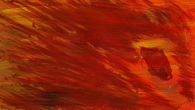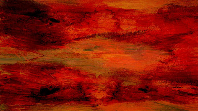

Now taking my rough thumbnails into Photoshop. I added the lighter orange coloured texture over the top of the sketch in the first image. The second I used my water coloured clouds which is my banner image and put the darker brown one over the top of those. I duplicated the clouds a couple of layers and then flipped them to make them more randomly spaced. They don't really have much definition at the moment, but I don't want my images to show a 'definite' object etc. I'm after an abstract look so that people can interpret what they wish to see rather than what I want to see. Though I may add more depth to the bottom image as it is I feel a little too abstract.
Like the image below doesn't really give very much information away, it does give a small hint into what cold be happening.


No comments:
Post a Comment