Friday, 25 December 2009
Friday, 18 December 2009
Wednesday, 16 December 2009
E.T
Next comes a confession. E.T gave me nightmares to. Not E.T itself cause the alien was rather cute. The bit which scared me the most was when the mum walks into the younger boy's bedroom and E.T is in the wardrobe disguised as a strange looking doll. It played on the fear of dolls and toys coming to life. I know, I was a strange child.
Tuesday, 15 December 2009
Final Idea Changed
Monday, 14 December 2009
Final Idea
Halloween (1978 film)
 I don't like horror films but this one was ok. I really liked the shots at the beginning of the film where the camera is in the POV (point of view) of the character. However, I don't think when I go to rangers, I'll be willing to play 'hide and seek' again. I also really liked the ending, with the shots of the rooms in the house. What also made it creepy was the fact that all the furniture was in the style which was around in the 70's. This helped me feel the unhomley feeling because the design was foreign to me as well.
Sigment Freud- Essay Research
http://books.google.co.uk/books?id=FLWP6SPGQuYC&pg=PA139&dq=Freud-+the+uncanny#v=onepage&q=Freud-%20the%20uncanny&f=false
The paragraph I am talking about is on page 139.
Sketch Ideas 4


Sunday, 13 December 2009
Sketch Ideas 3

The sketch above was inspired when Alison told me to visualize a room and how what would make it feel unhomly to me. My first thought was that, as my room is rather open and earthly, that if it were made from metal and machinery then it would become unfamiliar.
 Another thing which was suggested I try was to also visualize, what to me would make my home unfamilliar. If my family simply left without warning, without letting me know and unable to return. the image I thought of was an empty suitcase on the edge of a bed. This would be because suitcases are usually full of clothes and other items so for it to be empty would seem a little strange to me. Also I was going to try and give the room a dark appearance to try and hint that to be packing would at such a time would be a little bit odd as well.
 The sketch above I came up with when thinking about a busy area and what it would be like to have no one around. Here you have the usual table set up but n one around. I wanted to make the tables seem as if they'd been in use.
Thumbnails
Saturday, 12 December 2009
Feng Zhu
Thursday, 10 December 2009
The Uncanny and Matthew
Later on as we were coming back to the lift on the ground floor form taking a break, Alison spotted the photography display. One of the images was of a tasteful nude male. Matt then suggested that we (CG Arts and Animation) should do the same. This earned an instant ‘no’ from the both of us. However what Matt meant was we should display our work for all to see. Not go around being photographed in the nude.
Wednesday, 9 December 2009
Sketch Ideas 2
 I'm not entirely sure how I came to this idea. I guess I was thinking of the tree image I'd posted the other day, the one from my DoE hike and came up with this. To give it an uncanny feel I added a hand. I think this was a sketch that I drew before Phil said about not drawing humans into our images.
 I was thinking of the image that was in the lecture on Tableau Vivant created by Anna Gaskell *insert picture here*. The way she suggests something sinister happening by only showing some locks of hair.
 The box placed in the centre of this image would have been where I would have cropped it.

This idea simply came from on the train ride to uni. On the side of the tracks, I can't remember where abouts- between what stations there's a gate. Beyond the gate is a small track which goes around the corner and disappears from view because of the building in the way.
Perspective
http://mathforum.org/sum95/math_and/perspective/perspect.html
It gave me a clear understanding of where the vanishing point should go.
The Stepford Wives 1975
 I was really shocked with the end of this film. I was expecting Joanna to put up more of a fight. Especially when she saw that robot version of herself. However I rather liked the ending, the fact that she too was caught and transformed into the perfect house wife. Although I wasn't too impressed with the fact that she allowed herself to simply give in to her counter self. And why did Joanna allow the man to take her weapon from her? Those were the only disappointing aspects of the film for me. The fact that Joanna didn't put up much of a fight.
I saw Phil post a comment on Ruben's blog about searching for reviews.
http://uk.rottentomatoes.com/m/1074503-stepford_wives/
Looked up some on the website he recommended and there does seem to be rather a mixed opinion on the film. A majority of the people who reviewed didn't like the pacing of the film. They found it was rather slow in the beginning and then sped up towards the end. Another reviewer also commented on the effects of the film. The effects were cliche, such as the Gothic mansion and the lightning in the background.
Dead of Night

Tuesday, 8 December 2009
Selling Church
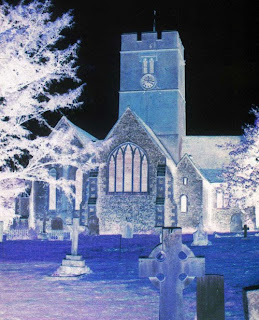

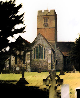
I also searched up the church I go to, which is the one in Selling. I then put it into photoshop. I tweeked it to see if it would help give me an idea once again of a creepy church. I looked up on the web to try and find some tutorials to make an image darker without loosing all the details. I soon found these
and decided to give them a try.
Church Idea

The image above is just so people can see what an Advent wreath looks like. It's not the one which was at our church. My idea came when I was sitting just in front of our Advent wreath. From where I was sitting I could just see the chior pews leading to where the alter wouuld be.
 http://www.filipinasoul.com/2008/04/paoay-church-of-ilocos-norte/
However my findings didn't turn out as inspiring as I thought they would. The majority of the churches were very brightly light. I will however in another attempt to figure to what I do to make the church unheimlich is ask the vicar what he think would become creepy..
Rule of Thirds
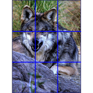
The rule of thirds is used to try and identify the four most important parts of an image. I already knew about the rule of thirds due to studying a subject which demanded it back in college. Below is a short video giving a simple explanation for how the rule of thirds is used in film making. Its useful to me because it recommends some tips for where the main focus points should be placed. Especially the point about, when filming of photographing people it's recommended that their eyes are in line with the top two main focus points.
Monday, 7 December 2009
Repulsion
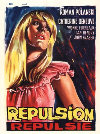

It may be the era the film was set in, but whenever the main character was sitting down and the camera was focused on the side of her face I just kept on seeing the same thing. The Martian disguised as a woman from the film Mars Attacks was all that I saw. It wasn't so much the fact that Carole and the Martian woman looked alike, the only slight resemblance would be the curls in their hair. It was more to do with the fact that, when Carole did sit in the position mentioned, she always statue like. She barley blinked and her humanity was also going. The Martian woman from Mars Attacks was the same. Where it was a Martian in disguise, the lack of blinking made the scene creepy. The image below isn't the actual shot I was thinking of, but it's the only one I can find of the Martian Disguised as the woman.

Jentsch
I thought I'd post th is up. I felt it was relevant to our project. It was something I came upon whihlst doing research for my essay.
More info can be found here
http://people.emich.edu/acoykenda/uncanny1.htm
Sunday, 6 December 2009
Sketches 1


 This is one of the first few sketches I did of what my final piece could be. I really loved the cropping that Deborah Mesa Pelly used in her image 'The Doll House'. I wanted to try something simmilar. I also then remembered a story I started years ago based on true events which happened one year at Guide camp. I started to re write it a few years later but only got as far as the begining of it. However the tissue box is of great significance. I started the story of as the main character telling the read a bit of what happend int he past. How they had a cold and for once managed to throw something into the bin without it bouncing off the edge and onto the floor. Below is the part I'm talking about and what this sketch was based upon.
'It started roughly two nights before I went to guide camp for that year. After snuggling down into bed, my nose begun to run, as, I was just getting rid of a cold from that week. Blowing it, I then scrunched up the dirty tissue before throwing it into the bin and, to my astonishment; it went straight in, straight through the middle to the bottom. Lying down, I thought nothing of it and I still don’t, I don’t know if it was that even which put my friends and I in the position we’re in now or if it was simply fate.'
Saturday, 5 December 2009
Essay Ideas
 I thought this image might be a pretty good one to write about. If not, I may have to consider I Robot.
Friday, 4 December 2009
Doppelganger
http://paranormal.about.com/library/weekly/aa111102a.htm
I've personally never seen anyone who looks like me, but I do have a twin. A friend of mine who was two years below me at secondary school was said to look like me. Although she was two years younger, slimmer, slightly shorter and was the total opposite to me (look wise) no one would take the answer 'we're not related at all'. They always insisted we were at least cousins because they thought we look like each other. We were even mistaken for twins more times than I could count. Not quite a doppelganger, but she was my 'evil twin'. It was because of her I eventually gained the nickname Lev.
Thursday, 3 December 2009
The Uncanny Valley- Vids
Alison posted these up onto her blogg and at the time I was doing Maya, so I went back later to look. Both give a clear explanation as to what 'The Uncanny Valley' is. Although the second one is more serious, both were rather helpful.
Wednesday, 2 December 2009
The Hostile Hospital
To help me get a better understanding of the uncanny and it's meaning I've been looking at
The Uncanny: An Introduction by Nicholas Royle
http://books.google.co.uk/books?id=XkvSWxjrMN8C&pg=PA1&dq=what+is+the+uncanny#v=onepage&q=&f=false
and
The Uncanny by Sigmund Freud, David McLintock, Hugh Haughton
http://books.google.co.uk/books?id=zqafz8HKpC4C&printsec=frontcover&dq=the+uncanny#v=onepage&q=&f=false
Out of both book, I'm finding that The Uncanny: An Introduction makes things easier. It also talks about the word that Phil used in the lecture, unheimlich. Unhomelyness, or
'It can consist in a sense of homeliness uprooted...'
The Cook, The Thief, His Wife and Her Lover

I finally got around to watching The Cook, The Thief and never again. It's not so much the gory content of the film that bothers me, it's just I found that the entire filmed bored me completely. It got the point where halfway through I found myself ignoring what was happening in the film and doing other things such as Maya work. I just found it too dark and violent for me to really follow the plot. Plus there scenes where I felt I should have known what was happening but then realized I didn't because it had moved rather quickly.
The Uncanny
Understanding the uncanny I tend to find I have to think about it a little as possible for it to make sense. It's one of those things that one thinks too deeply into it, then the entire meaning just becomes too hard to grasp. It reminds me of how, Lyra from Northern Lights (or the Golden compass) reads the alethiometer. the knowledge has to come to her and not she to it. I find it's the same with understanding the uncanny.
Tuesday, 1 December 2009
Invaders from Mars

For some reason I didn't like this film as much as 'Invasion of the body Snatchers'. Out of the two I definitely preferred 'Invasion of the Body Snatchers'. I guess this was because the ending in the other one made a lot more sense to me. Another thing I wasn't too keen on was the ending. I guess it's because it goes against everything I've been taught about story telling. I wasn't quite sure what to make of young David running with a recap of the entire movie blurred behind then waking up. I always remember my English teacher in secondary school telling us, when we end a story, never end it with 'and it was all a dream'. I did however read that when the film was released in England an alternative ending was filmed for it. In the alternative ending David's parents are replaced by the Pat Blake, the physician and Stuart Kelston the astronomer.
The film was created a few years before the 'Invasion of the Body Snatchers' , so the underline meaning of Invaders from Mars is the same. The fear of anything alien infiltrating what we know. I guess the reason I didn't like it as much was to do with the continues repeating of certain footage. I wasn't surprised when Phil said that they were running out of money when they made the film.
I also noticed that backgrounds in the film looked as if they were painted. Especially the scene where the camera was aimed at the fence ending at the sandpit. The only thought that went through my head at that point was 'Wizard of OZ'. Maybe because of the sets looking painted as I mentioned before but I'm not entirely sure why.

The good thing about this film though, is that I know I can sleep safely tonight.
Edward Hopper

 Both images play on the fact that the viewer want's to know what the person in the image is looking at. Also Edward Hopper is known to draw a lot of hotel scenes. This is because a lot of stories occur in hotels. People come and go and only snippets of their lives are viewed. Once they leave we never know what happens to them.
 The Iaea
'The Idea' I really didn't like at all. I really couldn't grasp what was happening in the story. There was something about the ants which could relate to the fear of nature overtaking, but I'm not certain.
The Father
Deborah Mesa-Pelly
Monday, 30 November 2009
Mise en Scène
B. A stage setting.
2. Physical environment; surroundings.
Having done a course at college simmilar to this one, I've came across the term Mise en Scène before. however it was at least a year and a half since I last heard it and decided to look up the defenition.
Sandy Skoglund

During the lecture, Phil showed us a selection of different artists who create images based on the theme of Tableau Vivant. This images is known as 'Revenge of the Goldfish'. I really like the fact that it has a dream feel to it. It plays on hidden fears of what feels safe and familiar to us can be turned into a nightmare. Thanks Phil for pointing out the mix up between artists as well.


